In real estate, buyers and sellers often look to “comps” to help determine a home’s value. Comps are usually an average price at which similar homes in the area have sold in the recent past. Since a home is most people’s largest investment, buyers are keen to get good value for their money.
ETF investors want to do the same. But determining an ETF’s comps can be difficult, especially once you get past the big questions of asset class and geographic exposure. Our approach has always been to simply look at the ETFs with the most overlap in underlying holdings. You can see these on the ‘Comps’ tab of any equity fund page.
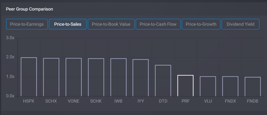
Now we can help you see how an ETF is valued versus its comps. Or to put it more accurately, we can show you how the stocks in an ETF are being valued by the market, versus the stocks in similar ETFs. On the ‘Valuation’ tab we added a chart that allows you to compare an ETF against its 10 closest comps on six different valuation metrics:
- Price-to-Earnings
- Price-to-Sales
- Price-to-Book Value
- Price-to-Cash Flow
- Price-to-Growth
- Dividend Yield
The peer group is sorted, with the fund you’re examining in white so you can instantly see where it stands versus its comps: cheap, expensive or in the middle.

Charts and data in the Valuations and Fundamentals tabs are available to both Individual and Professional subscribers, and all subscriptions start with a one-month free trial. If you’re already a Basic (Free) member, you can start the free trial by logging in and then navigating to My Account -> My Subscriptions and choosing ‘Upgrade’.
Whether in real estate or ETF investing, you want to get solid value for your money. Looking at Comps can help you determine if you are–or if you should perhaps look at the competition instead.


